Informational Website Redesign for UC San Diego Zero Waste
I led the redesign of UC San Diego’s Zero Waste website to improve discoverability, accessibility, and student engagement across a platform serving 40,000+ users. The project streamlined navigation, clarified sustainability resources, and created a more inclusive, task-driven information architecture.
UX
UI
Product Design
Marketing
Summary
Role: Lead Product Designer
Team: Administrators (2), Developer (1), Product Designer (Me)
Timeline: 12 weeks (2024)
Tools: Figma, Nielsen Heuristic Guidelines, WCAG Accessibility Guidelines
I led the redesign of the University of California, San Diego (UC San Diego) Zero Waste Department website to improve discoverability, accessibility, and student engagement across a platform serving thousands of students and staff. The site functions as the central hub for campus-wide sustainability operations and resources.
Following post-pandemic leadership and operational changes, the website required a clearer information architecture and more user-friendly navigation. As a Zero Waste Ambassador, I collaborated with administrators and developers to streamline content, strengthen visual hierarchy, and align the experience with accessibility standards. I ensured sustainability resources and engagement opportunities were easier to find, understand, and act on.
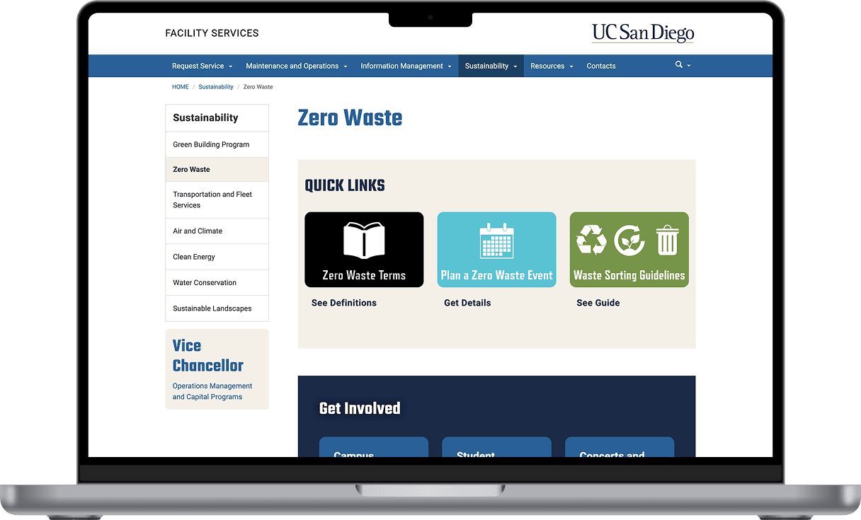
The Problem
The original website was cluttered, outdated, and hard to navigate. It hid essential resources behind large blocks of text and lacked clear visual hierarchy or accessibility features. As a result, students struggled to find actionable sustainability resources, and engagement with campus initiatives remained low despite increased institutional investment. It became necessary to approach the redesign by asking, "What can I do to improve usability and increase engagement with campus sustainability efforts, while aligning with digital accessibility standards?"
Challenges Identified:
Outdated content and broken links
Overwhelming, text-heavy structure
Unintuitive navigation system
Inconsistent visual style and color usage
Weak visibility for student engagement opportunities
Limited accessibility alignment with UC standards
Audit of existing interface revealed low hierarchy, inconsistent spacing, and limited guidance for task completion.
Research and Evaluation
Given confidentiality and time constraints, I chose heuristic evaluation as the fastest way to identify high-impact usability failures that could be addressed within a single development cycle.
My key focus areas included:
Visibility of system status (link feedback and navigation clarity)
Consistency and standards (alignment with UC Facilities Management)
Aesthetic and minimalist design (reducing text fatigue)
I also drew inspiration from the UC San Diego Student Organization and Facilities Management pages, which offered examples of high-traffic layouts and better information grouping.
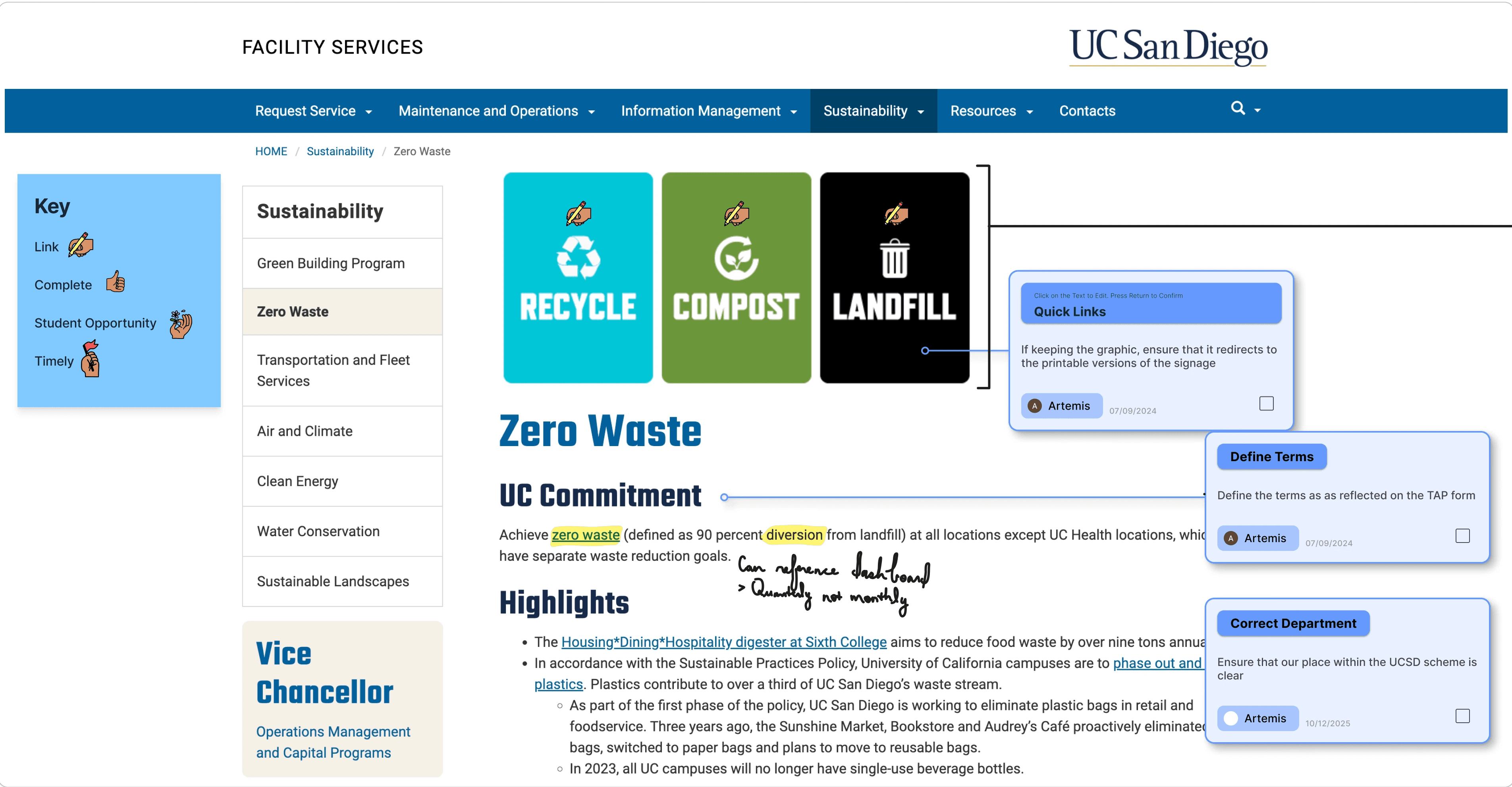
Synthesis of user insights highlighted key friction points in navigation, content grouping, and information clarity.
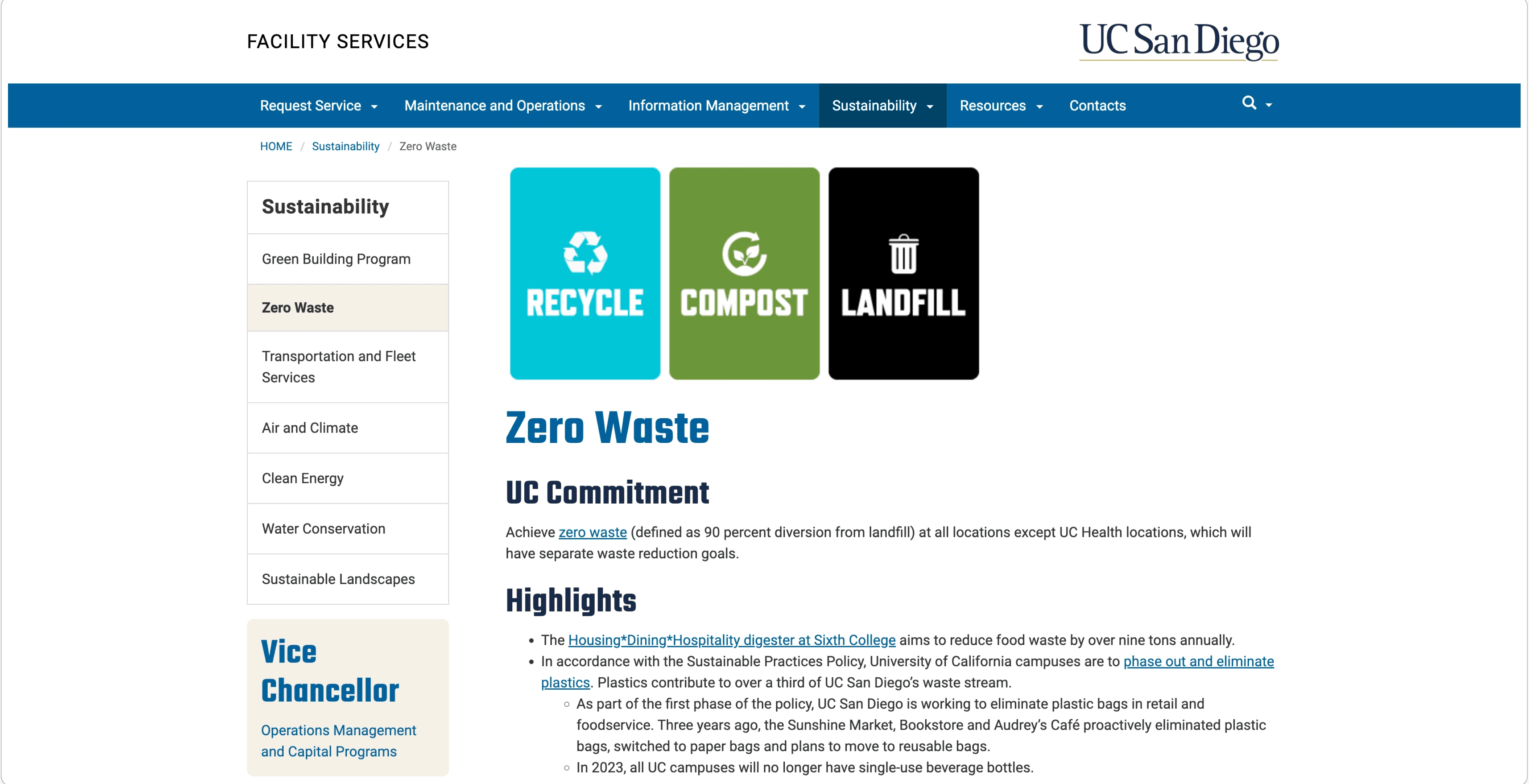
Design Approach and Constraints
The redesign focused on clarity, simplicity, and engagement. My goal was to make information about sustainability efforts easily discoverable while maintaining UC San Diego’s recognizable visual language.
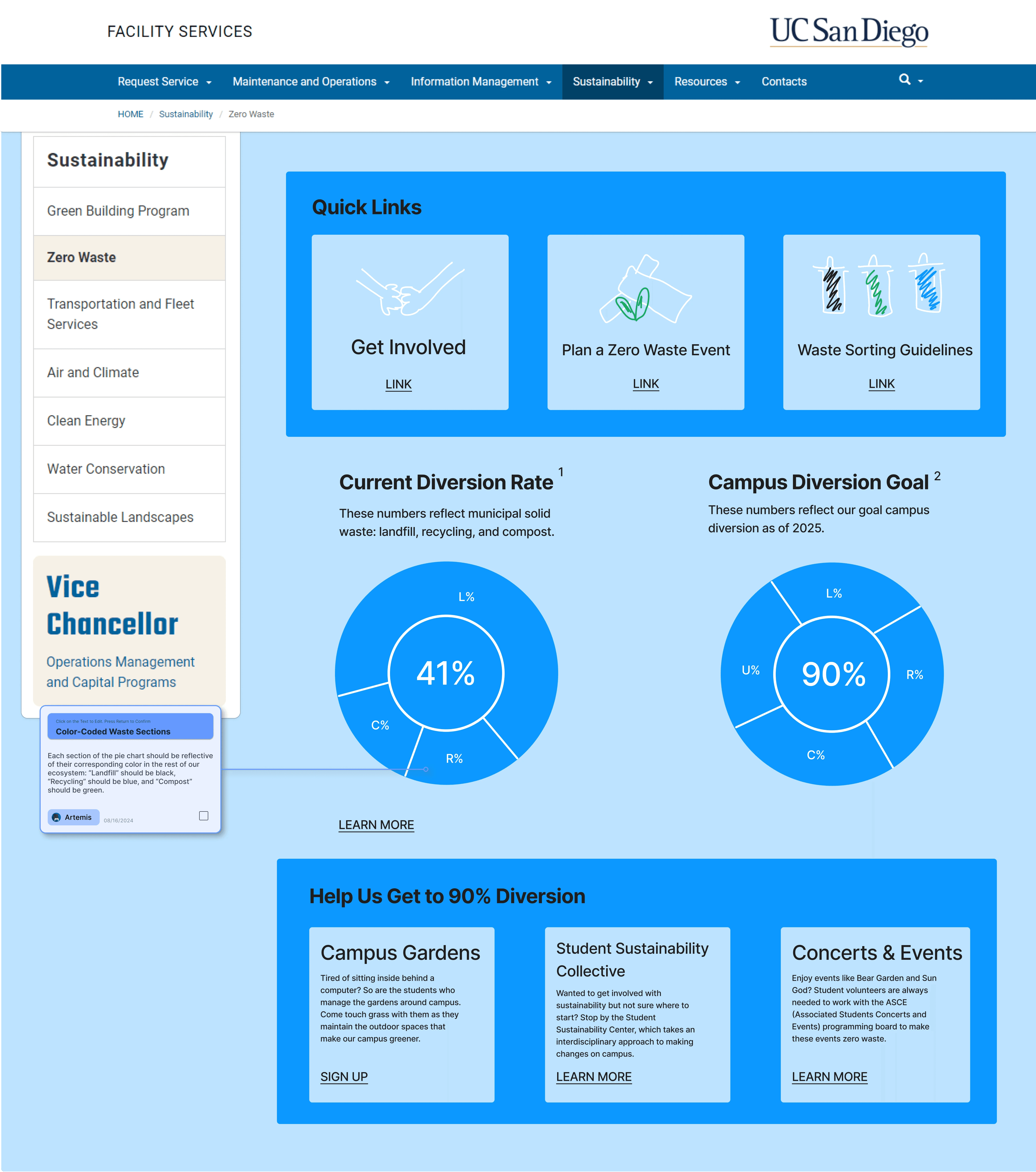
Key additions included:
Quick Links section for immediate access to core resources
Data Visualization area to highlight waste audit results
Student Ambassador section to feature leadership and volunteer opportunities
Refreshed color palette reflecting UC San Diego’s core blue tones and waste stream colors (black, green, blue)
Accessible typography and consistent component spacing
Accessibility compliance remained a guiding principle throughout this project. However, departmental leadership selected final brand colors in their own departmental meetings, which did not fully meet WCAG contrast requirements. This limitation was documented for future review, laying the groundwork for more stringent accessibility alignment in later iterations.
Low-fidelity structure established a cleaner task flow and reorganized content to improve wayfinding.
Information Architecture
I prioritized task-based navigation over departmental structure, ensuring completion of core actions within 1–2 clicks regardless of prior knowledge.
Revised Structure:
Quick Links: Core resources (sorting guides, data, policies)
Data Dashboard: Visual metrics of waste diversion
Student Ambassadors: Profiles of the students behind UC San Diego’s zero-waste efforts
Get Involved: Volunteer and internship opportunities
Campaigns: Departmental and campus initiatives
Sorting Guide: Expanded waste categories (including e-waste)
Dictionary: Detailed definitions of relevant terms
Policies: Departmental reports and documentation
Note: Bolded text indicates implemented features on the live site.
The Final Design
The final UI maintained UC San Diego’s recognizable aesthetic while enhancing usability. A balanced color palette, intuitive link indicators, and simplified layouts made the site more approachable for both students and staff.
Typography and iconography followed UC system design standards to ensure accessibility compliance.
Note: Final brand colors were selected under departmental guidance and do not fully meet WCAG contrast requirements. Recommendations for future adjustments were documented to support ongoing accessibility improvements.
Impact and Reflection
Outcomes:
Reduced cognitive load by consolidating 8+ content categories into 5 task-based sections
Improved discoverability of student opportunities through dedicated Ambassador and Get Involved sections
Established a scalable information architecture as a reference for future departmental updates
This project taught me the importance of patience and structure when working asynchronously with multiple stakeholders. Despite limited user testing opportunities, collaborative feedback and heuristic evaluation drove strong results.
“Seeing the finalized site live was deeply rewarding. It reflected not just a better product, but growth in my professional process as a designer.”