Gamified Sustainability App for PlanetFlip
I helped redesign PlanetFlip’s task and messaging system to improve user engagement and retention in a sustainability app. Through behavioral research and emotional design, I created a scalable, gamified task framework that made climate action feel approachable, rewarding, and easy to repeat.
UX
UI
Product Design
Marketing
Summary
Role: UX Researcher, UI Designer
Team: Product Designers (4), Developers (5)
Timeline: 10 weeks (2024)
Tools: Figma, User Interviews, Competitive Audit
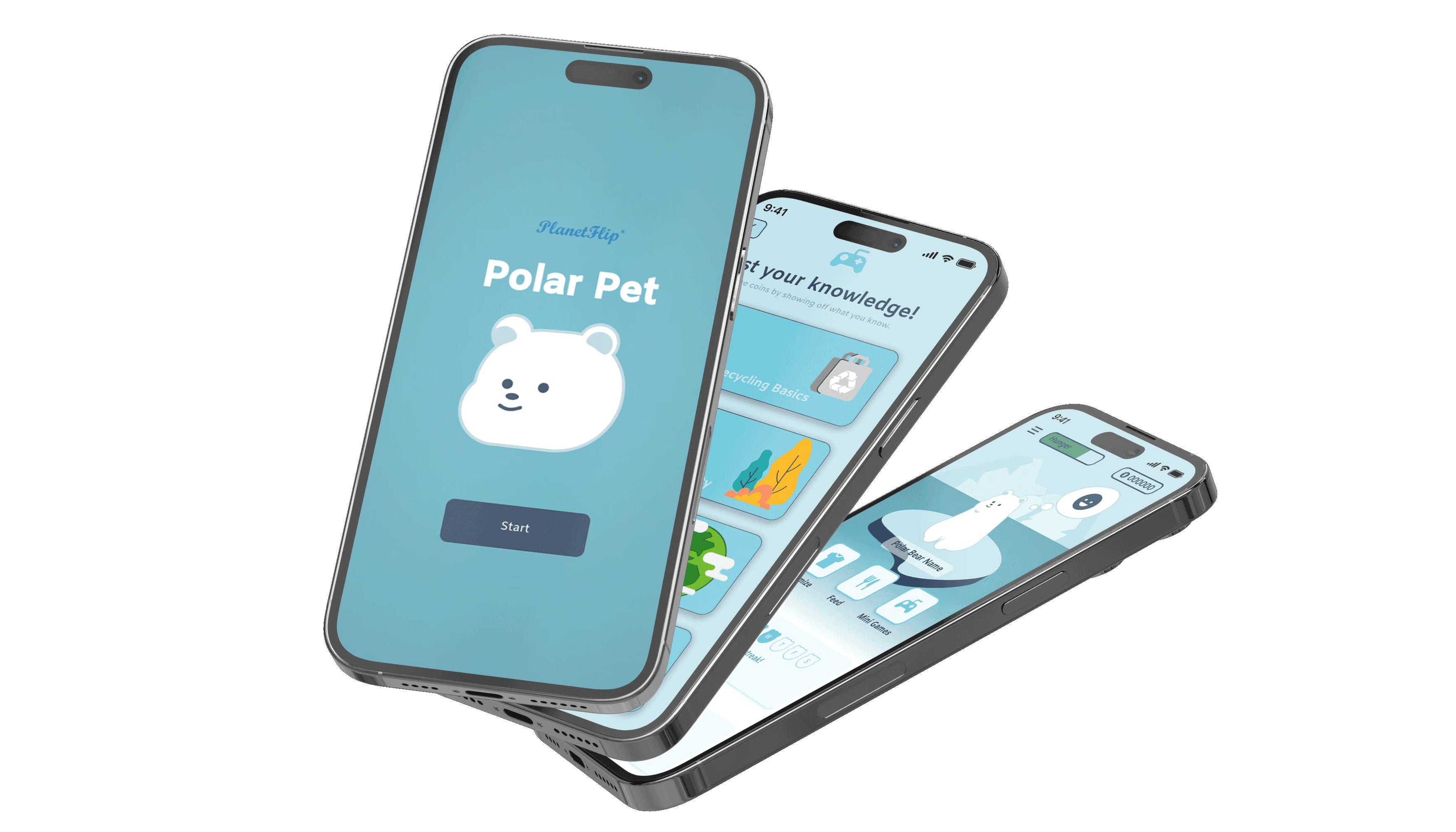
PlanetFlip is an educational companion app designed to increase engagement and retention around sustainable behaviors through gamified interaction with a virtual polar bear. The product translates everyday eco-friendly actions, such as recycling or conserving water, into lightweight, repeatable tasks that feel achievable and rewarding.
As part of the UC San Diego–PlanetFlip collaboration, I led research and design decisions to improve task clarity, emotional connection, and long-term engagement. Working within existing wireframes, I redesigned the task system to reduce overwhelm, personalize difficulty, and make climate action feel intuitive, approachable, and motivating for everyday users.
The Problem
Many sustainability apps struggle to sustain engagement. They often present abstract data, lengthy explanations, or goals that feel unattainable for average users. PlanetFlip’s early prototypes faced similar issues: complex tasks and detached interfaces reduced motivation rather than inspiring it.
In addressing these concerns, I asked, "How can I reimagine the task and interaction system to make sustainability feel approachable and rewarding to drive real-world action?" The primary goal was to improve early retention and task completion by reducing overwhelm and increasing emotional investment.
Challenges Identified:
Tasks felt too large-scale or vague to act on
Limited emotional connection between users and the polar pet
Outdated educational tone, which reduced retention
Minimal personalization in task difficulty
Inconsistent visual hierarchy and feedback cues
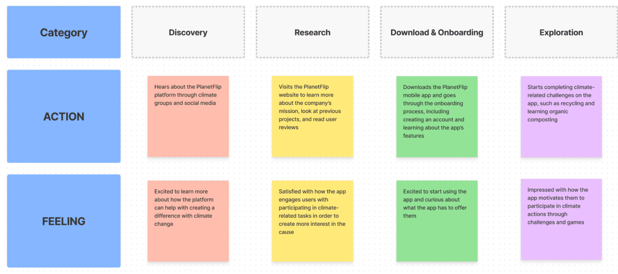
Framing the core challenge and establishing an action plan for this project.
Research and Evaluation
Our team began by studying competing sustainability and education apps to identify what kept users engaged or drove them away. We discovered that most lacked modern retention features and community-building incentives.
Leveraging my experience in student climate programs, I led the design of the task difficulty framework, ensuring that actions scaled from low effort to high impact over time. To provide variety and gradual challenge, I created a difficulty ranking system based on resource demand and time commitment. This feature kept tasks accessible while giving returning users room to grow.
To better understand our target audience, we also developed user profiles informed by current sustainability research and ongoing environmental initiatives. These profiles captured users’ motivations, knowledge gaps, and behavioral patterns, ensuring that PlanetFlip’s task content reflected both authentic climate action themes and relatable daily habits.
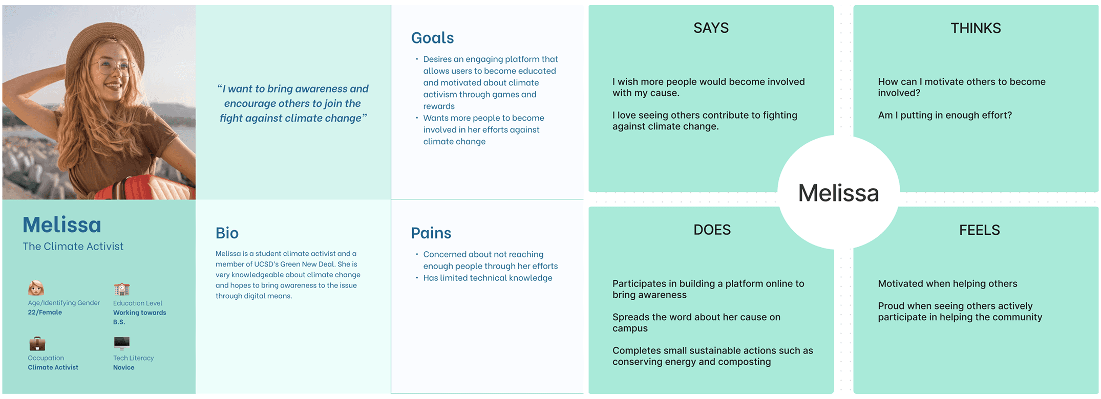
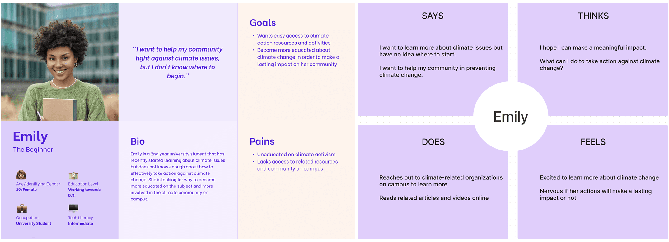
Synthesis of user motivations to clarify where guidance, pacing, and encouragement would reduce overwhelm.
Design Approach
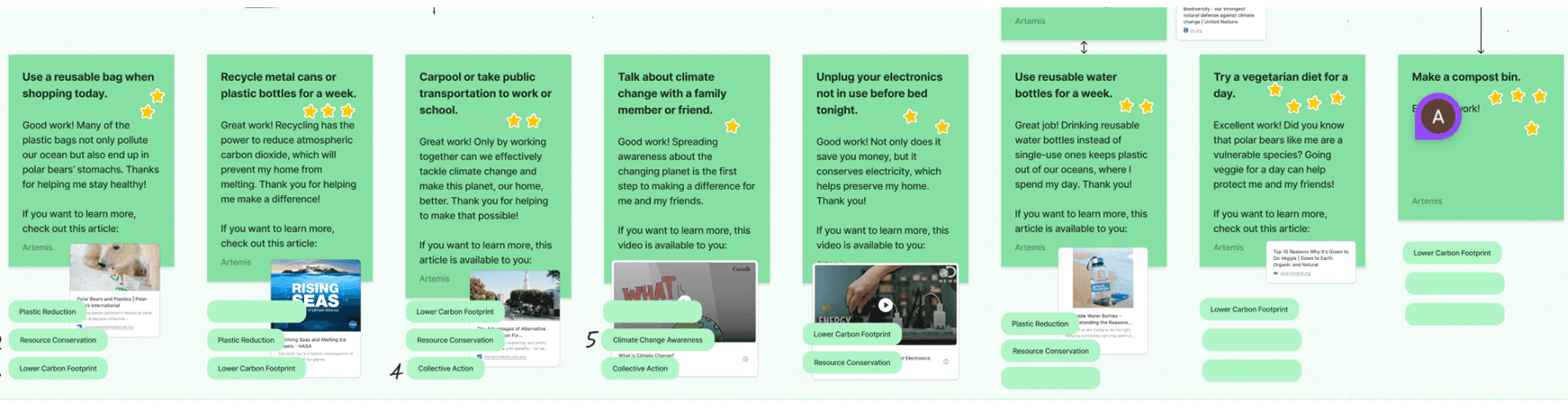
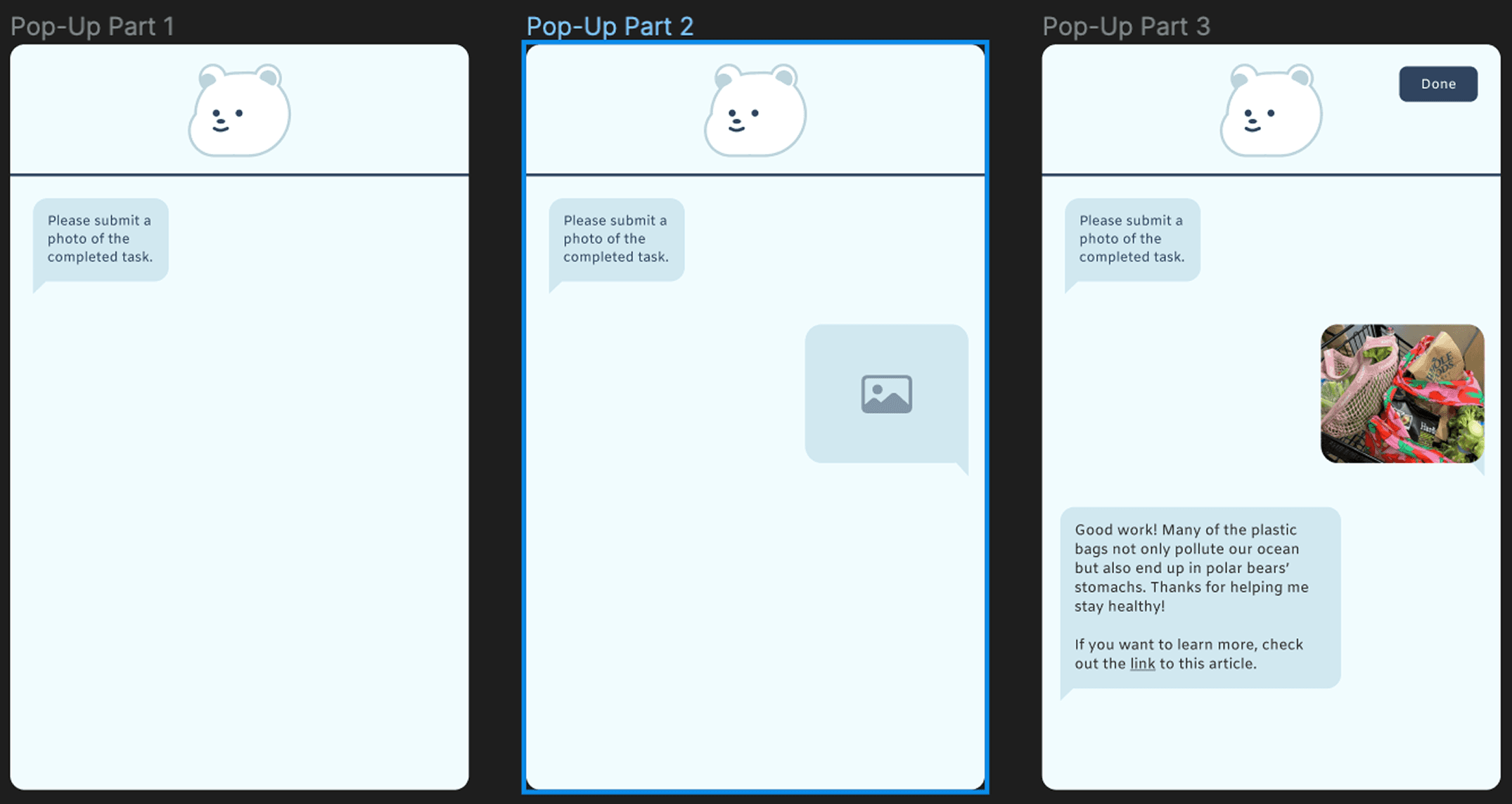
To strengthen the emotional connection between users and their polar pets, I introduced a chat-based task interface inspired by familiar messaging platforms such as iMessage and WhatsApp. The team opted for this conversational interface over a dashboard-style task list to reduce intimidation and mirror familiar social interactions, accepting lower information density in exchange for higher approachability. This conversational system allowed the polar bear to “speak” to users, acknowledging their completed actions, guiding them through new challenges, and offering a friendly, narrative tone.
Each message included a contextual link to trusted climate sources, accommodating users with varying levels of subject knowledge. Maintaining PlanetFlip’s established color palette and line style was essential, so I prioritized simplicity and consistency while adjusting layout spacing for readability and warmth.
Preliminary user interviews validated these decisions: participants responded positively to the interface’s friendliness and minimal detail, describing the polar pet as “cute,” “motivating,” and “approachable.”
Exploration of early flows outlining how conversational prompts and lightweight actions could support task progression.
Constraints
Working within an existing app framework presented creative and technical limitations. The color palette, iconography, and layout grid were inherited from a previous design team, leaving limited flexibility to introduce new visual elements, especially ones that might be more accessible. Additionally, because the development team predetermined design timelines, user testing and iterative refinements were constrained. Despite these boundaries, I focused on enhancing usability and emotional engagement within the established system—proving that meaningful improvements can emerge even under tight parameters.
A cohesive interaction model that improves clarity, supports incremental behavior change, and strengthens engagement.
Design System and Consistency
Working within an existing Figma framework, I emphasized visual balance and continuity with the previous student team’s work. Color and iconography mirrored PlanetFlip’s established design language, implementing subtle blues and whites to reinforce the polar theme. I documented every new UI element, page states, message templates, and task categories, for handoff to the development team, ensuring consistency across future iterations.
The Final Design
Impact and Reflection
After completing our high-fidelity wireframe, we handed the design to the engineering team to develop the animated pet experience. Our documentation, slide decks, and annotated prototypes guided their implementation process.
Outcomes:
Increased emotional attachment to the virtual pet, as validated in early user interviews
Simplified task completion into lightweight, repeatable actions
Created a scalable task and messaging system that could support future personalization
Enabled smooth engineering handoff through detailed interaction documentation
Reflecting on this project, I gained significant experience designing within constraints, respecting prior work while refining function and tone. It reinforced the importance of early research, emotional design, and clarity in technical handoffs.
“As rewarding as it is to design from scratch, learning to evolve an existing product taught me just as much, especially when designing for causes that matter.”