Interactive Inventory Interface Inspired by Minecraft
To strengthen my visual design and component-building skills in Figma, I recreated the Minecraft inventory interface as a personal design experiment that merged playful self-expression with precision in layout and interaction design.
UX
UI
Graphic Design
Summary
Role: UX Researcher, UI Designer
Team: Solo Project
Timeline: 1 week (2025)
Tools: Figma, Wireframing
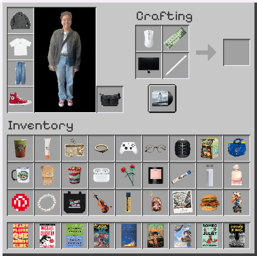
What began as a fun, low-stakes project evolved into a meaningful exploration of interface logic and visual identity. Inspired by the Minecraft inventory screen, I designed a personalized version that organizes everyday objects—books, tools, snacks, and accessories—into a structured, pixel-based layout.
Created entirely in Figma, this experiment became a study in interaction systems, spatial hierarchy, and affordance design. By treating my personal items as assets within a familiar digital schema, I used this interface to explore how systems thinking can represent identity through design.
Objective
I wanted to test how a familiar game interface could be reinterpreted as a framework for self-expression: something both systematic and personal. The goal was to blend game interface logic with real-world context, showing how consistent hierarchy and affordances could organize identity within a designed system.
This project challenged me to think beyond simple recreation, asking: What makes an interface feel functional, legible, and emotionally resonant, even outside its original context?
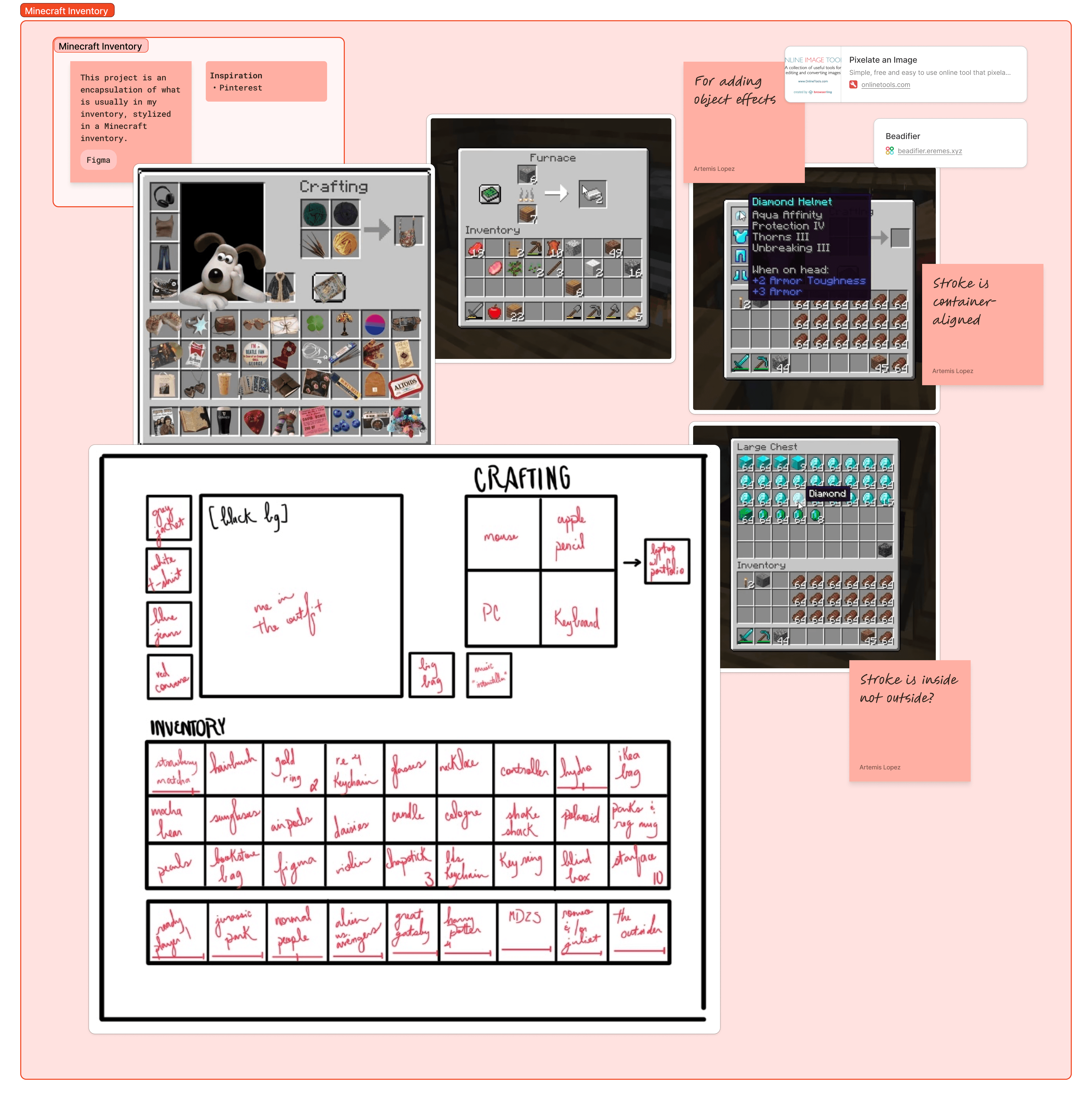
Initial sketch outlining the foundational structure and informing the spatial logic of the redesigned inventory.
Design Approach
The sketch depicted above informed the structure of this design. I extensively studied how the original interface communicates affordances — what can be clicked, moved, or crafted — and mirrored that logic through consistent iconography and spacing. I have spent hundreds of hours watching Minecraft playthrough videos from creators like Karl Jacobs and GeorgeNotFound, which I leveraged in my design process.
In my reinterpretation, each section serves a distinct cognitive role:
The Character Panel establishes the focal point for identity and presence.
The Crafting System visualizes synthesis and creativity, symbolizing the act of combining tools to manifest new ideas.
The Inventory Grid organizes items into sections by object type, mirroring need-based tasks.
Each object was treated as an interactive unit, carefully scaled and placed to preserve alignment and spatial logic. These affordances were partially functional, allowing users to hover over each item for additional information and change the state of the Crafting System.
The sketch also informed the taxonomy of categories, personal essentials, creative tools, and media influences, creating a narrative through spatial grouping rather than text.
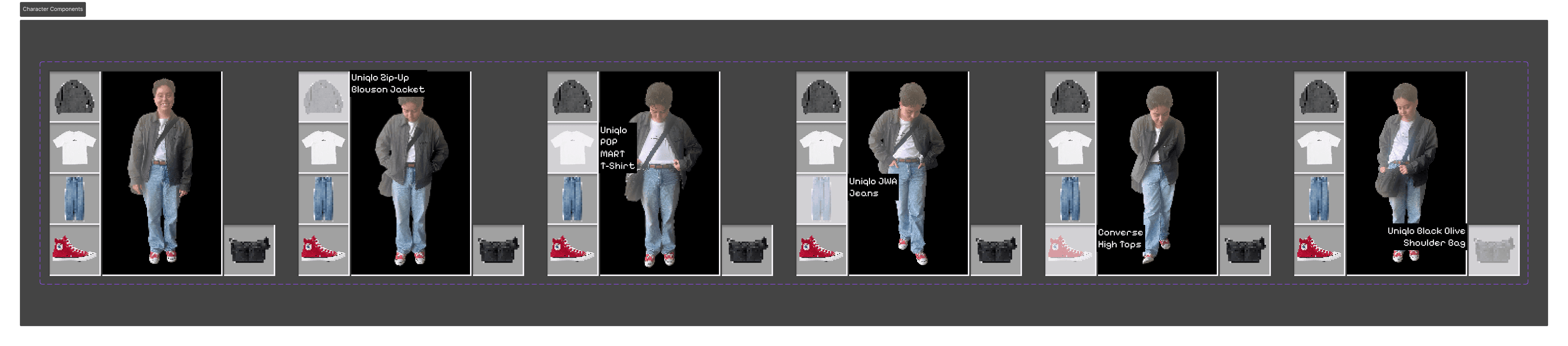
The Character Panel component prototype, showing the variants that support hover-based interactions.
Design Process
I began by diagramming the inventory layout to understand Minecraft’s visual rhythm: the balance of uniform grid spacing and bold visual contrast. Each cell was recreated in Figma as a component, ensuring consistency across every element.
The crafting interface became the conceptual centerpiece, representing how creativity emerges through combination. I used this metaphor to bridge my identity as both designer and player, making the interface not just a display of items, but a commentary on process and iteration.
To maintain visual authenticity, I replicated the pixelation and drop-shadow layering found in the original game UI. The color palette and text treatment were kept neutral to foreground the items themselves, creating a balance between familiarity and reinterpretation.
Impact and Reflection
This project reinforced the role of UX structure even in playful design contexts. I learned to analyze an interface not only by its appearance but by its interaction logic: how layout, spacing, and grouping shape user behavior and meaning.
It also honed my component-based thinking, pushing me to manage layers, variables, and reusable assets efficiently. More importantly, it showed me how visual systems can communicate personality and narrative when designed with intentional hierarchy.
The Minecraft Inventory project taught me that even playful design can reveal the fundamentals of user experience. Recreating and reimagining this interface helped me practice precision and storytelling simultaneously, bridging emotional resonance with systemic clarity.
Through this exercise, I reinforced my love for design: the balance of logic, creativity, and a bit of fun pixel-perfect detail.
Takeaways:
Interface recreation can be a powerful tool for understanding UX systems.
Affordance design communicates function even without interactivity.
Visual hierarchy can tell personal stories through spatial grouping.
Playful experimentation strengthens technical precision and creativity.
“Every interface tells a story; this one just happened to be mine.”