Social Media Campaign for Crumbl
To explore how established brand systems can be translated into short-form content, I created a social media demo inspired by the dessert company Crumbl, focusing on motion, hierarchy, and replicable content structure.
Marketing
Graphic Design

Summary
Role: Visual Designer, Content Strategist
Team: Solo Project
Timeline: 3 weeks (2026)
Tools: Figma, Motion Design, Archival Research
This project explores how a highly recognizable brand translates consistency into short-form content.
Using publicly available brand guidelines, social media content, and archived advertising campaigns, I developed a social media demo that mirrors Crumbl’s established pacing, composition, and visual hierarchy.
Rather than recreating a single post, I focused on building a replicable content system: one that could support weekly menu updates while maintaining a consistent visual identity.
Objective
I set out to understand what makes branded social content feel instantly recognizable within seconds. The goal was to translate Crumbl’s identity into a structured system that supports fast, repeatable content production.
This project explores how to balance those constraints within a single, scalable format, centralizing the question How might a short-form content system remain visually engaging while maintaining strict consistency across iterations?
Research and Analysis
Over three weeks, I analyzed Crumbl’s social content, identifying patterns in pacing, framing, typography, and motion.
To extend beyond current content, I used the Wayback Machine to recover past flavor releases and campaign assets. This helped reveal how the brand maintains consistency while rotating weekly offerings.
Concept Development
An early concept explored using four cookies arranged like multiple clock faces, emphasizing variety and rotation across weekly drops.
However, this introduced visual noise and weakened the focal hierarchy. I ultimately simplified the concept to a single cookie as a clock, allowing for a stronger silhouette, clearer read, and more consistent motion system.
This decision reflects a broader principle that clarity scales better than complexity in fast-paced content.
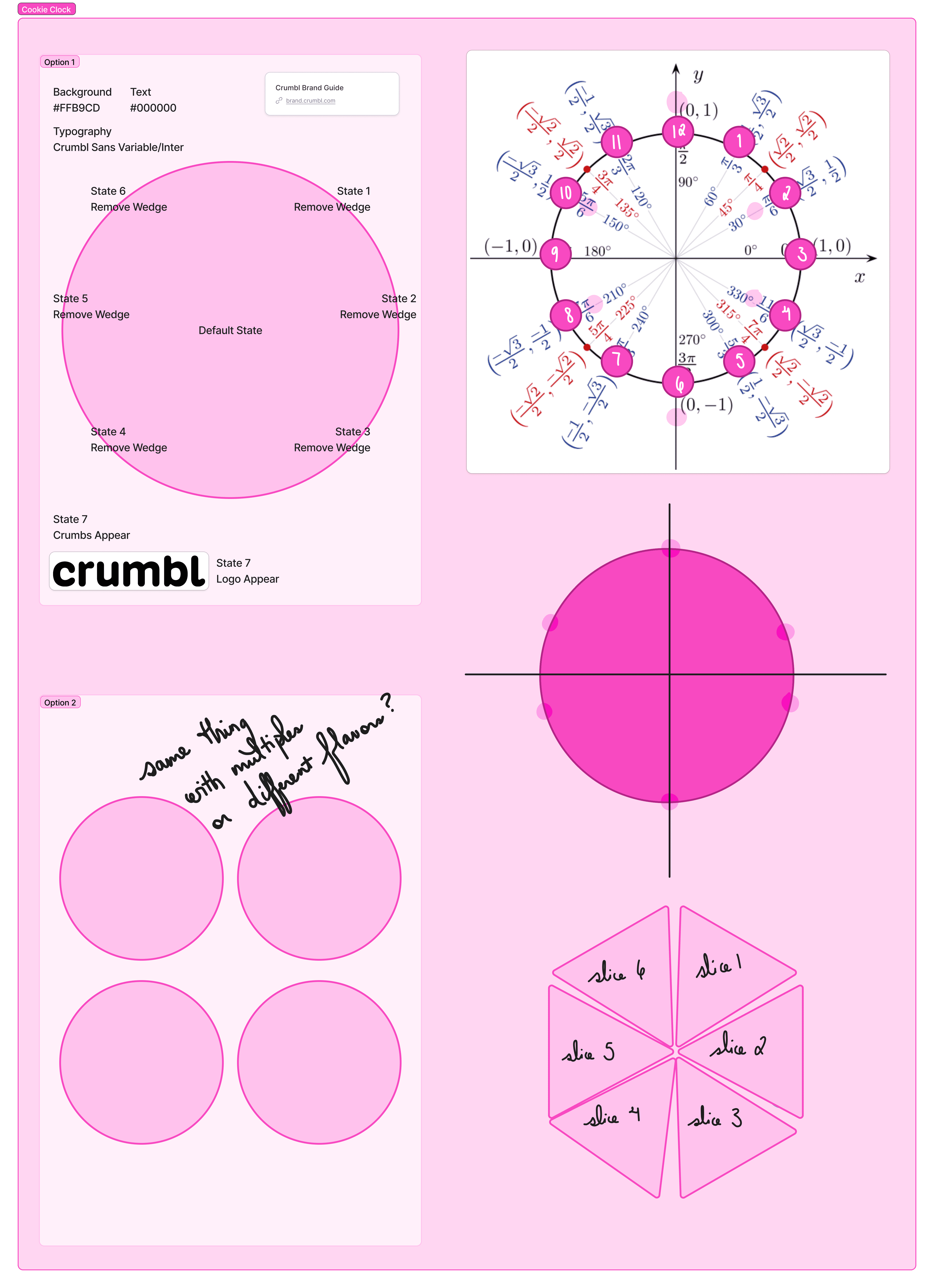
This is the first sketch of the concept, nicknamed "Cookie Clock," demonstrating my initial thought process on structuring the design into multiple segments.
Physical Prototyping
To better understand how the product behaves when deconstructed, I purchased a box of Crumbl cookies and physically cut and photographed them.
I handled each cookie with gloves and maintained a clean workspace to visualize how variations in texture would affect physical modifications. Even if I personally favored authenticity over aesthetics, the brand guide would overrule me, especially given the inconsistencies in lighting and color between the physical product and marketing materials.
Ultimately, rather than relying on my assumptions, I used a real-world reference to guide the design process.
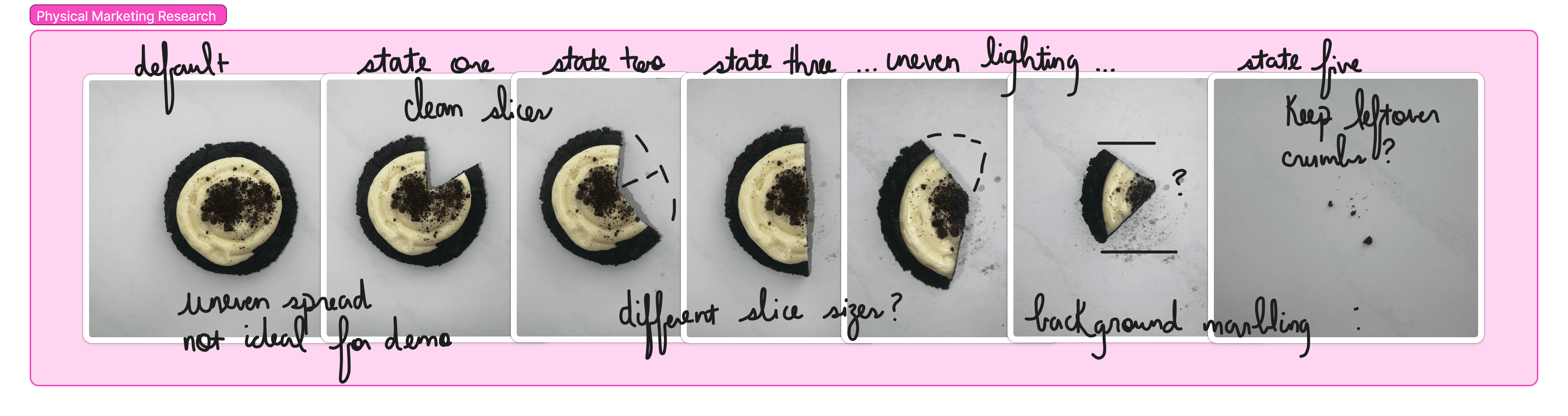
Although I originally intended to use the above images in my final demo, the results of physical prototyping forced me to modify my approach.
Design Approach
The final system was built around a single, circular focal point. To ensure precision, I used a unit circle to define spacing, rotation, and alignment of all elements within the composition.
This allowed me to:
Maintain consistent radial balance
Anchor motion paths to predictable geometry
Ensure visual harmony across frames
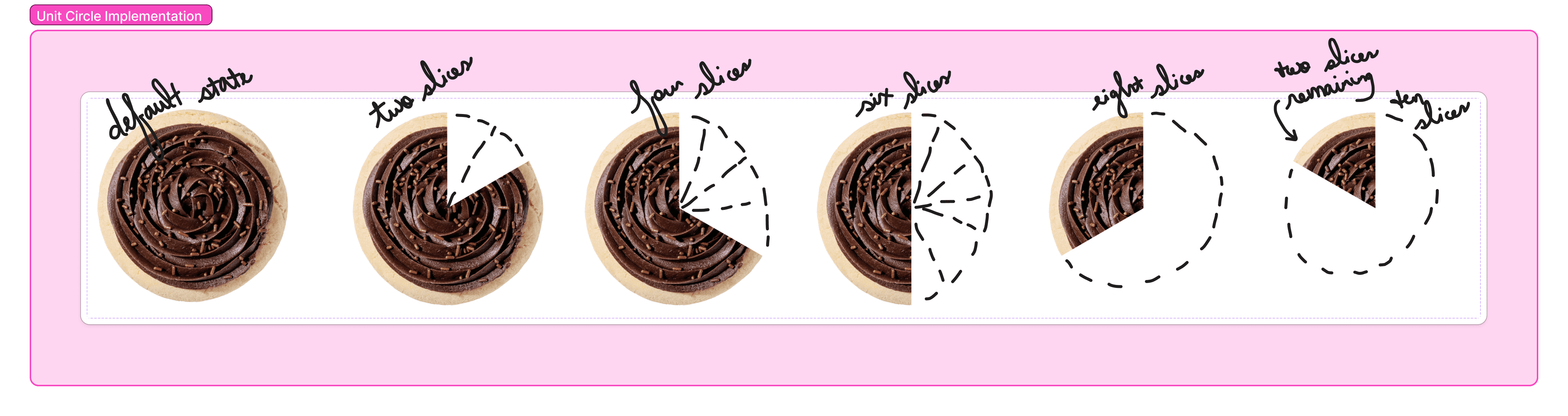
Using the assets I recovered from the Crumbl website and Wayback machine, I divided each circular cookie into twelve pieces and excluded the segments accordingly.
I built the system in Figma using a component-based workflow, mirroring professional production pipelines. Establishing reusable component structures with solid layout and animation allowed me to test variations in color and size of various brand assets.
Each segment of the demo serves a defined role:
Hook Moment: Immediate motion or transformation to capture attention
Product Focus: Close-up detail emphasizing texture and quality
Information Layer: Minimal, well-timed text overlays
Brand Reinforcement: Clean end-state composition
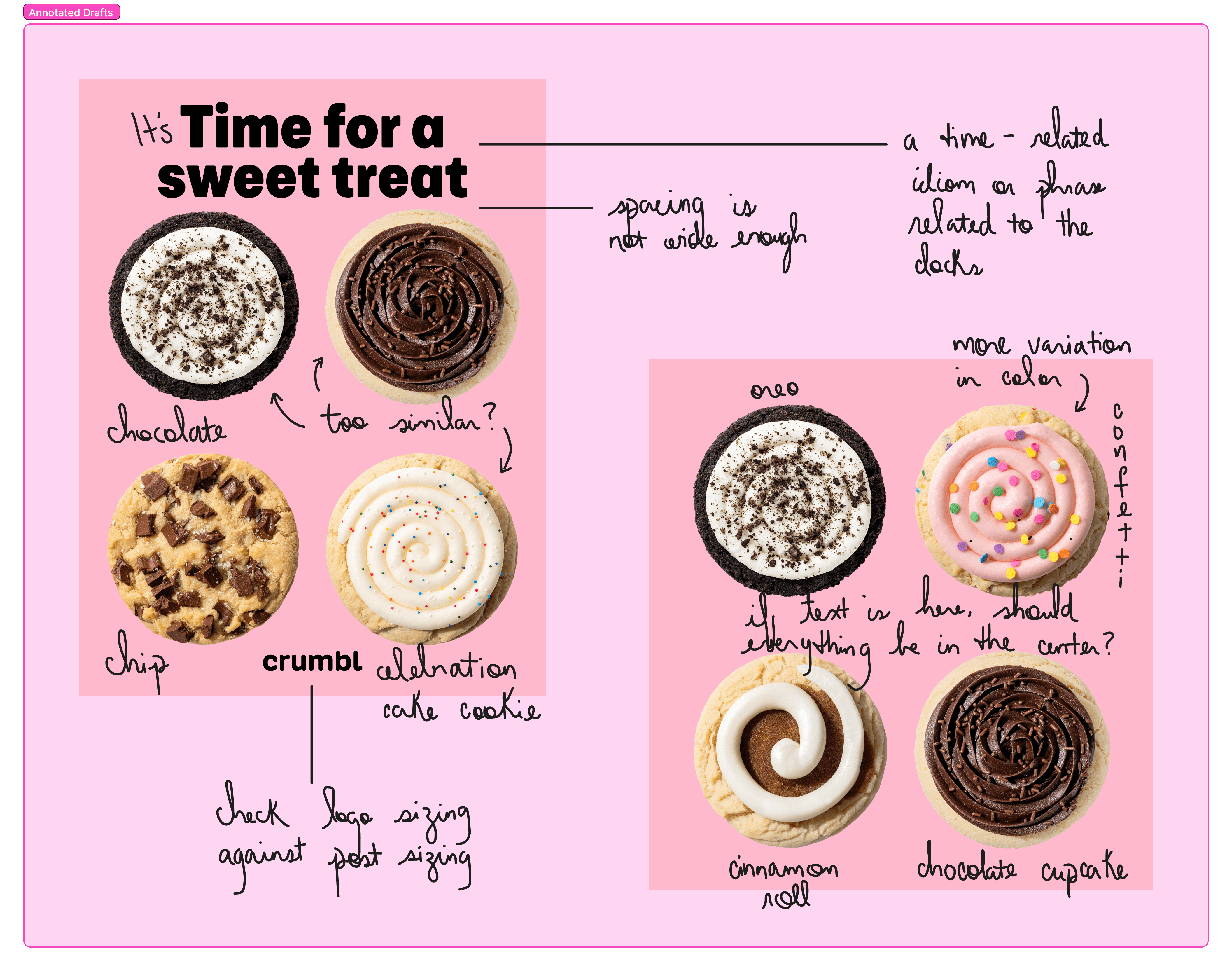
Using Crumbl's brand guidelines, I critiqued my existing designs to identify areas for improvement.
Impact and Reflection
This project shifted my understanding of social media design from isolated visuals to replicable systems.
The most important improvement came from simplification. Reducing complexity made the content more legible, scalable, and aligned with real user behavior.
I also strengthened my ability to reverse-engineer design systems, validate ideas through physical prototyping, and build scalable assets using component-based workflows.
Takeaways:
Simplification improves clarity and scalability
“Bad” iterations are essential to strong outcomes
Real-world reference leads to more believable design
Component systems enable efficient production
Motion should reinforce structure, not distract
“Consistency is not restriction; it is what makes variation possible.”